Homepage
http://charlottewhite92.blogspot.com/
Research Analysis
http://charlotte-analysis.blogspot.com/
Social Groups
http://socialgroups-charlotte.blogspot.com/
Initial Ideas
http://initialideas.blogspot.com/
Front Cover Process
http://frontcoverprocess.blogspot.com/
Contents Page Process
http://contentsideas.blogspot.com/
Double Page Spread Process
http://doublepagespreadprocess.blogspot.com/
Final Outcomes
http://finalmagazine-charlotte.blogspot.com/
Evaluation Questions
http://charlotte-evaluationquestions.blogspot.com/
Tuesday, 30 March 2010
Friday, 5 February 2010
Existing Magazine Logos
Before i decided on a final logo choice for my magazine i felt that it would be beneficial to look at existing magazine logos. I also chose to look at a couple that were of a similar genre to the magazine i am going to create. By looking at logos from magazines of similar genres i can determine what sort of thing i need to make my reader 'hooked' and want to buy and read my magazine.

The NME logo is a large bold font this is probably because of the way that the creators of the magazine wanted it to stand out and appeal to the readers. It uses the colour red with white and black around the edge for extra emphasis and exaggeration. Also the way in which the colours red, white and black are all in a way interlinked. By the colours being interlinked it makes them alot more appealing to a reader. Being interlinked in a way means that they share similar values. The colour red relates to being 'hot' and 'stop'. Therefore these colours will attract the reader and grab their attention. It will not be obvious to the reader that these colours have been used for such purpose but contiously there is a reason as to why everything on a magazine is chosen.
Also the way in which the font has very sharp edges rather than being rounded off. This gives the impression of the edgy and individual image wanting to be created. Once again this is another thing that relates back to the specific genre of the magazine and it makes the target audience feel as though they have an involvement and that they are more associated with what is going on.

For example i chose to look at the logo of the NME magazine this is because this magazine holds similar genre conventions to the one that i am intending to create.

The NME logo is a large bold font this is probably because of the way that the creators of the magazine wanted it to stand out and appeal to the readers. It uses the colour red with white and black around the edge for extra emphasis and exaggeration. Also the way in which the colours red, white and black are all in a way interlinked. By the colours being interlinked it makes them alot more appealing to a reader. Being interlinked in a way means that they share similar values. The colour red relates to being 'hot' and 'stop'. Therefore these colours will attract the reader and grab their attention. It will not be obvious to the reader that these colours have been used for such purpose but contiously there is a reason as to why everything on a magazine is chosen.
Also the way in which the font has very sharp edges rather than being rounded off. This gives the impression of the edgy and individual image wanting to be created. Once again this is another thing that relates back to the specific genre of the magazine and it makes the target audience feel as though they have an involvement and that they are more associated with what is going on.

I also chose to look at the logo for the magazine of Q. This was because this magazine is of a similar genre to the one that i am aiming to create. It also follows the codes and conventions that i will be following throughout the creation of my magazine. Ofcourse in some ways i will try to challenge these but i will mainly be sticking to what is represented and shown in a magazine. This logo is alot more simple compared to the NME one it only uses two colours rather than three. Although only two colours are used it still manages to create a similar sort of affect. Sometimes using a more simple logo can be just as affective as anything else. It is all as long as the logo fits in with the intended and specific genre.
Friday, 29 January 2010
Layouts
 Before creating my magazine cover I decided to create some mock layouts. These layouts were based on the codes and conventions of existing magazines. By looking at existing magazines and their layouts it gives me good indication as to what the audience are attracted to. Also the layouts on the existing magazines i chose to look at were of the same genre magazine as the one that i am going to create. I used the codes and conventions that were displayed on the magazines of NME and Q.
On my first mock up of the front cover i chose to stick to the codes and conventions as one of my options but i felt that this wasn't the image that i wanted to create on my front cover and that i wanted to challenge in them some slight way perhaps.
By using the codes and conventions that are used on existing magazines it will make my magazine appear alot more realistic and appealing to my specific target audience. This is because of the way that things will be situated on the page will be easily recognised and stand out to the reader. Although it is important that the codes and conventions are followed it would also be good in someways to challenge what exisiting media do and change it in some slight way.
Logos

Before i chose a final logo to use on the front cover of my magazine i had to go through a process of looking at loads of different styles and designs before finding one which would most suit the genre and style of my magazine. After looking at a few logos myselfs and gathering my own personal opinions i decided that it would be a good idea to go and question people about what they thought of the different logos and perhaps which one would be best suited for my work.
By doing all of this i believe that it will help me gain a better idea and understanding about what my target audience want from my particular genre of magazine.
By doing all of this i believe that it will help me gain a better idea and understanding about what my target audience want from my particular genre of magazine.
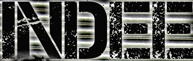 This was the logo that i chose to use for my magazine. It was a font taken from photoshop and its called CAPTURE IT. Overall i picked this one above all the others because of the way in which it created that edgy yet quite simple effect that i was looking for. It is a large chunky text that will stand out to a reader and grab their attention immediately. Although it is large and chunky it still uses this messy look because of the way in which it is patchy with bits missing. This makes it seems less clean and smooth and therefore meaning that they are rock 'n' roll and like to go with the flow kind of lifestyle. This font also has an individual sort of look and this is what my readers are looking for. They are the sort of people that dont like to be the same as one other person but this doesnt just apply to things like clothes this also applies when it comes to magazines, music and places to even hang out in. So overall i feel that this font will stand out to my intended audience and will challenge their thoughts and emotions it will make them want to buy the magazine because when they look at it they will know what affect it is trying to create and present. The reader will also feel engaged and understand the individual look that is trying to be created.
This was the first logo i chose to look at and consider for my magazine. This font was found on dafont.com and when first looking at it i thought it would be a good representation of font for the Indie genre of magazine. Looking at a lot more i felt that it wasn't particulary what i was looking for. For example i feel that the sort of font that i will need to make my magazine work effectively will be something that has an edgy and individual look just like the way the people interested in my genre are. The reader needs to be able to feel like they can feel related and engaged with the magazine.

This was then another font that i chose off of dafont.com. To begin with i thought that this font had a good look to it and that it would look quite affective. But then after deep thought and consideration i decided that it did not have the right affect that i was looking for in order for me to attract my desired audience. the way in which it is not in a straight line makes me think that it will draw the reader away and have an opposite affect. I think that it would make the magazine look less proffessional and more like a child had just drawn it all together. This font doesnt show consistancy and therefore it would be less easily remembered and overall just not as effective.
Subscribe to:
Comments (Atom)